

Last year, Valiant Comics started its limited run and then ongoing series Faith with which I fell in love. Deeply in love. When comiXology Originals and Valiant offered to give GeekMom an exclusive debut of the Valiant High #3 cover (Issue #2 is on sale today!), I had to take it on because, Faith. My response was, “I love Faith so much, I’ll cover anything with her.” Little did I know that I was in for a treat.
Comics, for me, need to be a perfect blend of art and story. In the same way that I am insanely fussy about music needing to be compositionally and lyrically satisfying, my comics need to be artistically and narratively satisfying. In that related sense, I have a wide berth of artistic styles that I love. However, I’m not one of the big, bloody violent battles type of people. Therefore, a lot of Valiant’s world feels outside my wheelhouse. Here’s what I have to say about Valiant High:
It. Is. Adorably. Amazing.
Keeping in mind that I love both Tiny Titans and Gotham Academy, Valiant High perfectly fits in my zone and draws me back into the publisher’s universe.
The premise of the book, like both Tiny Titans and Gotham Academy, is a reimagining of the Valiant world as high school students and their teachers. As someone who started with Harbinger when it first came out, then fell out of the narrative because I didn’t have a pull list yet, I recognized some of the names when I started reading. For example, Toyo Harada is the principal of Valiant High. Bloodshot is the coach. Ninjak is the “new kid.” For those well-versed in the Valiant universe, this series provides an enjoyable little brain vacation. In fact, I wish there were going to be more than three!
But what about the art? I love the art. The artistic presentations of the characters are a pastiche of styles. Torque and X-0 both have a particularly manga look that comes from the cheek lines on their faces. Charlene’s pink hair fluffing out around her face coupled with the defined cheek bones, thin mouth, and narrow eyes creates an aesthetic reminiscent of Harley Quinn from Batman: The Animated Series.
This mosaic of artistic comic references works particularly well with the story that brings together a series of characters who would otherwise inhabit diverse worlds. For example, Ninjak’s angular and darker imagery matches his spy stories. In addition, the cover of issue #1 utilizes a red-yellow explosion in the background which then highlights his purple and black suit in the foreground. When Colin walks into Valiant High for the first time, the light wood door frame is highlighted by a bright light background that mimics the explosion on the issue #1 cover. This reimagining of the Ninjak cover with a sense of whimsy is what makes Valiant High a fun read.


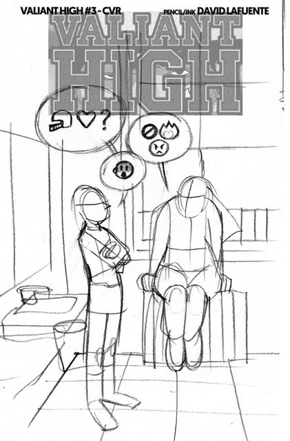
For Issue #3, Lafuente brought that whimsy directly to the cover with the Faith/Livewire emoji conversation. As someone who teaches information literacy, covers like the Valiant High Issue #3 are perfect lessons. Young people today communicate visually. These communications have meaning not just within their worlds but within ours as well. Seeing that used artistically and showing it as language matters to our development of these literacies. Lafuente’s process art shows the different decisions made when trying to appropriately capture teen culture in a meaningful way. This kind of attention to detail transforms Valiant High from a “fun little read” into something worth looking at more critically.

As sad as I am that issue #3 is the penultimate installment of Valiant High, I’m thrilled that I had the chance to meet these teenaged versions of Valiant’s characters. I hope that someday they bring them back for some more teen romps.
