New comic book day brought some excellent surprises for our team. As we’ve said before, one of the best parts of being a fan of serial media (TV, comics, so forth) is the constant surprise of what comes next. I might only read a book a week, but when I get new comics, I might read five or six titles in a day. All those stories in progress, blending together in such a cool way. I absolutely love them.
This week, we bring some brand new comics to you; several of the titles we’re talking about are first issues. We had a lot of fun this week, and not much in the way of stinkers. Check out the new comics we loved, and as always, if you think there’s something we’re missing, make sure to tell us in the comments.
Outer Darkness #1
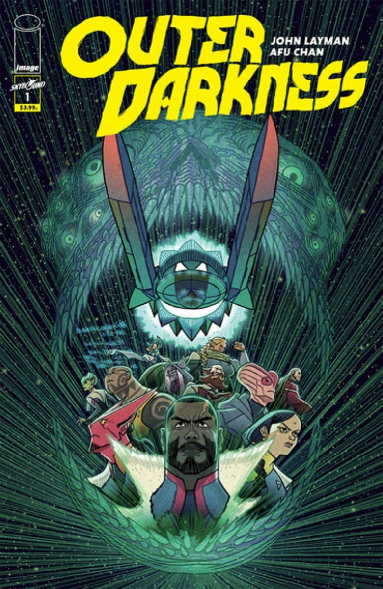
Writer: John Layman
Artist and Colors: Afu Chan
Cover Artist: Afu Chan
Publisher: Skybound (Image)
Luke: I don’t even know where to start with Outer Darkness #1. Honestly, the entire thing should be one giant hot mess. This should be one heaping plate of overambitious disaster. A steaming pile of failure. John Layman and Afu Chan should have a ticking time bomb of disaster on their hands. Instead, they have created my favorite comic that I read this week. This month, even. The whole thing is unbelievably fun.
The first issue of Outer Darkness begins with what appears to be demon space ghosts attacking a ship while a crew member is vomiting a swarm of what appears to be intangible sentient insects. In one scene, criminals are fed to an ancient Sumerian god in order to power a spaceships engines for an intergalactic rescue mission. And by issue’s end, the mission is only just getting underway. The actual story is just barely starting, and somehow all of the above was worked into the plot already. And Layman and Chan make it work.
The art is vibrant and expressive. The inclusivity of a range of diverse characters is done so organically that you could gloss right over it if you weren’t aware of how huge of a need this is in comics. The bizarre mix of possessions and ancient gods and aliens and spaceships and whatever else all fits together to create a future that feels fully fleshed out and, most importantly, exciting to be in. And the whole thing manages to be sheer fun the whole time.
I can’t even begin to explain how Layman and Chan did it, but they created one of the most fun space opera horror comics of the year. Do not miss this.
West Coast Avengers #5

Writer: Kelly Thompson
Artist: Daniele Di Nicuolo
Colorist: Triona Farrell
Cover Artist: Stefano Caselli & Nolan Woodard
Kay: Issue #5 of West Coast Avengers was fascinating to me. It broke a Marvel trend that I’ve been used to (dealing with) for a very long time. Artists wrote six issues, just enough to fit in a trade, and then there would be a new arc. If that didn’t work out, there would be five issues, then a fill-in or one-off issue. Six issues to a trade.
More and more often, Marvel’s trades have five issues, making the typical arc work better. The prices on the trades have stayed the same or gone up, but that’s a different conversation.
One thing I’ve really enjoyed about West Coast Avengers is that it has read to me like an older comic in some ways. Heroes are always reintroduced at their first appearance. Issue #4 wraps up the initial arc, but issue #5 doesn’t pick up out of thin air. The issue opens with a seriously deep cut back to Young Avengers, when Captain America was furious that the team was using the Avengers name without his okay. Beautiful. Madame Masque lures the team into a trap at an abandoned carnival, and we continue to explore the inter-team dynamics, and it’s all beautiful.
I enjoyed seeing Gwenpool breaking the third wall more, confusing the hell out of everyone since she knows she’s in a comic book. Hawkeye’s banter continues to be on point, and there are some truly glorious exchanges between America and Kate.
We get a new artist in this book; previously, Stefano Caselli had been doing interior art, but Daniele Di Nicuolo’s start was so seamless that I didn’t realize there had been a transition on my first read-through. I was sad to see Kate’s hip holes return; I’d love to see an overall redesign on her costume to make her belt into a utility belt and just… more useful overall. But I’ll live. And I’m sorry if this starts to feel repetitive, but Triona Farrell continues to be absolutely brilliant on colors.
This issue ends on a note that picks up from the last issues of Thompson’s unfairly canceled Hawkeye: Kate Bishop. I think the carry-over works well; there’s not a lot to explain, though reading the previous volume could give a reader more context for why Kate’s emotions are running high at the end of this issue.
If you’re not reading West Coast Avengers, you should be. It’s the best modern team book I’ve read in absolute years. That said, this might actually be a book best read in single issues. The current trade solicit puts issues 1-5 together, and that might actually read very strangely, depending on what’s happening in issue #6. We’ll see.
Lodger #2

Writer: David & Maria Lapham
Artist: David Lapham
Cover Artist: David Lapham
Publisher: Black Crown (IDW)
Luke: Readers of Comic Book Corner might remember my review of Lodger #1, which appeared in our October 27 edition. I said a lot of nice things about that issue. If you haven’t yet, go check it out! You can read it here.
So, the big question is, does the second issue of Lodger live up to the first? Is it still “a story that will be very important for the genre and the medium”? Did I layer too much excess on that first issue and now find myself thinking of a way to gracefully back that praise up a smidge?
Maybe a touch of the latter, but mostly a solid no. The Laphams are genuinely doing excellent work here. This second issue gives us more backstory, showing us how our two protagonists met each other, while in the present, Ricky goes further and further down a dark path as she chases the man who destroyed her family.
I will say that the time between issues was a little challenging for me. I was excited to dive back into Lodger, and yet I didn’t find myself immediately grasping where everything had left off. This might, in retrospect, be a series best read in a collection, but that will be easier to tell as we get further into this saga. Suffice it to say that it would help to skim the first issue before giving this one a read.
All-in-all, Lodger continues to be a stellar exploration of the lengths someone will go to get revenge on the man who made so much hell out of their life. It is dark, gritty, and impossible to put down. The art fits the story like a glove, and you will quickly find yourself re-immersed in the story of Ricky’s revenge quest. Fans of crime comics should take note.
The Unstoppable Wasp #3
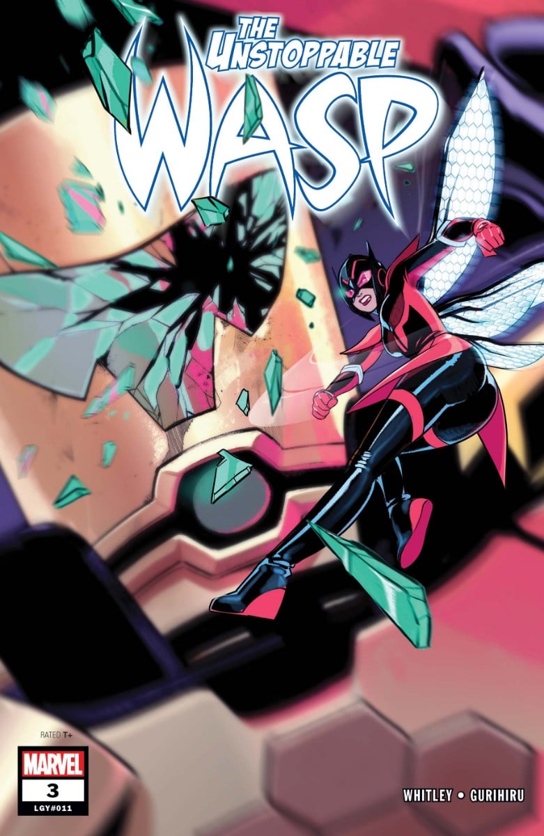
Writer: Jeremy Whitley
Artists: Gurihiru
Cover Artist: Stacey Lee
Kay: Fresh off their evening out in issue #2, Janet and Nadia Van Dyne return to G.I.R.L. labs to see that the facility is under attack by AIM. Nadia and Ying storm in while Janet and Bobbi (Morse, Mockingbird) try to hold them back. (“They never listen! It’s like being on a team with Hawkeye all over again!” “Try being married to him.”)
This is one of the first times we’ve really seen Nadia cut loose in battle. Instead of her “neat science facts,” we get “Nadia’s Neat Assassination Facts.” This issue is full of excellent, well-drawn combat sequences, and I was so happy to see Whitley adjust his sometimes wordy style so that the art had space to really shine here.
For the first time since we’ve met Nadia Van Dyne, I think this issue really sees her brought to a low point. Most of her team members are hurt, both of her mentors are badly injured (Bobbi says her leg is broken, Janet says her shoulder is dislocated). Something is going on with Priya; she is both on the AIM helicopter and caught in her greenhouse, exposed to some sort of gas that has knocked her out. Whitley teased the cover of issue #4 on Twitter a while ago; the image will be Nadia, with red-rimmed eyes and a shell-shocked expression, standing in front of a blackboard where the words “fix everything” are written over and over.
This issue takes Wasp to a different place. The first run was hamstrung by its early cancellation; the pace was rushed as the team seemed to try to get enough story out that the book could be picked up in the future. Now, it feels more like the book has some backing, and that the team can more easily commit to a story. Of course, this is issue #3, so often considered crucial to publishers—even though books like Wasp are frequently only mediocre sellers in single issues and then kill it in trades. I’m crossing all my digits that this book gets the time and space it deserves to tell the story it’s telling; I’m so engaged, and the next issue can’t come fast enough.
One bright emotional moment that I just have to call out: Shay (tiny gay disaster, remember?) and Ying embracing after Ying calls Shay her girlfriend while trying to rescue her. My queer heart went pitter-pat; it’s incredibly rare that queer characters get partners in mainstream comics, much less get to have sweet and authentic relationships in them. This quick scene was also masterful pacing; it gave me a moment to breathe in all the action and fear before diving back up and driving the stakes higher.
Well done, Unstoppable Wasp. Don’t stop now.
G.I. Joe: A Real American Hero —
Silent Option #1
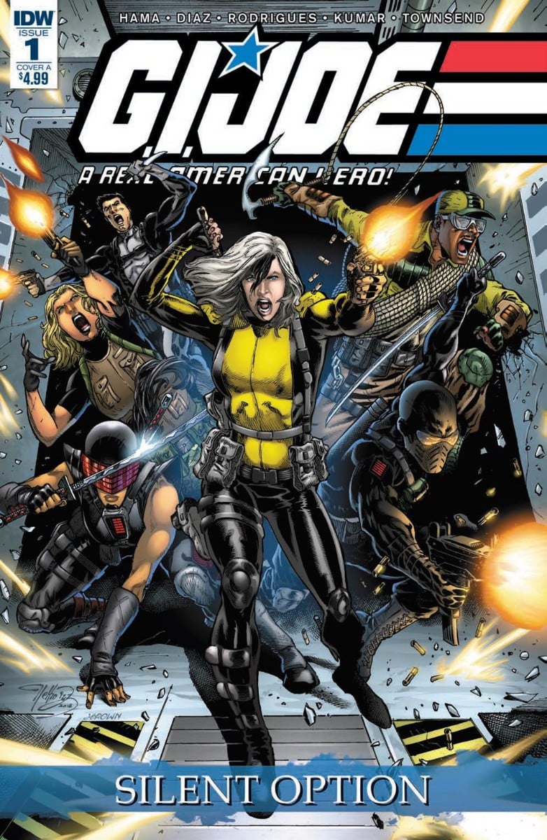
Writer: Larry Hama
Artists: pencils by Netho Diaz, inks by Alisson Rodrigues & Jagdish Kumar
Colorist: Vinicius Townsend
Cover Artist: Netho Diaz and James Brown
Publisher: IDW
Luke: When I was growing up, I loved G.I. Joe. I had a stack of action figures, I watched the cartoon, and I devoured the comic. Larry Hama’s work on G.I. Joe: A Real American Hero was an enormously important story for me as I was growing up. When, a few years back, Larry Hama and IDW brought G.I. Joe: A Real American Hero back, I was a little too buried in life to follow along, which was always a little disappointing for me.
Hama’s new G.I. Joe: A Real American Hero turned out to be pretty successful. It keeps coming out month after month, year after year, while many other series are born, live, and die. And when I was finally able to pursue comics more fully, it felt like there was a massive backlog of catching up to do. So when I saw an off-shoot miniseries was being released, this seemed like the perfect time for me to dive back into G.I. Joe.
Which is a long way of introducing the fact that I was really disappointed when G.I. Joe: A Real American Hero – Silent Option #1 ended up being not that great. All-in-all, it isn’t a terrible comic. Not by any means. It just wasn’t particularly stand-out either. Perhaps part of it was because this was my re-introduction to the story because this felt like an issue designed to move the plot from point A to point B. And in this, it succeeds. But it didn’t feel like a dynamic start to a story, and instead felt very much like it was business as usual.
The art by Netho Diaz matched Hama really well here, in that it told the story efficiently but didn’t particularly stand out. For this issue, Diaz appears to be focusing on clarity rather than artistic dynamism. That isn’t a bad choice, as many artists overdo the experimental nature of their art and the story becomes difficult to follow. It was easy to tell characters apart, and the action scenes made sense and weren’t confusing. There just wasn’t a particular aspect of the art that really stood out.
I plan to finish out G.I. Joe: A Real American Hero – Silent Option because of my love for G.I. Joe and Hama’s work. But this was not the sparkling start I had hoped for. If you are a fan of the current run of G.I. Joe: A Real American Hero, then give this one a go. If you are looking for a standalone military thriller, consider waiting for more issue to be out before deciding on a verdict.
My Little Pony: Nightmare Knights #1 and #2
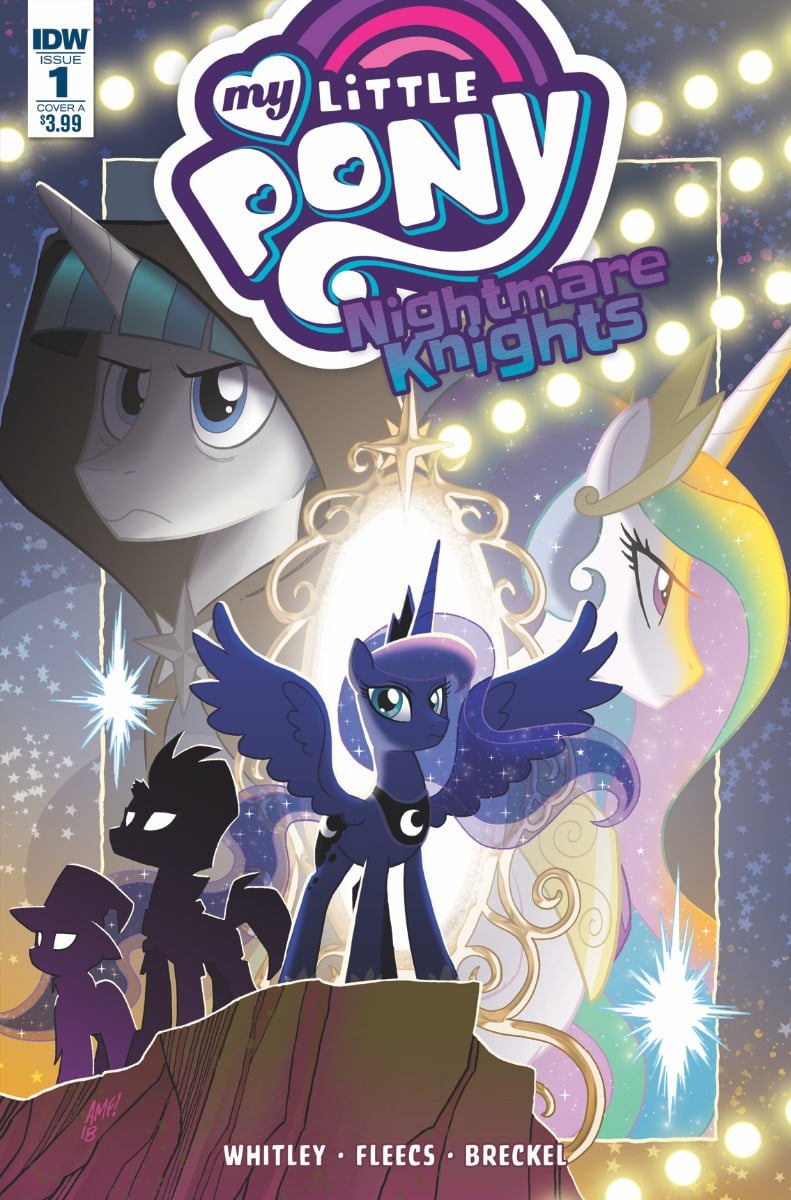
Writer: Jeremy Whitley
Art: Tony Fleece
Colors: Heather Breckel
Publisher: IDW
Kay: Like a lot of parents my age, I grew up on the ’80s version of My Little Pony, with Megan and sea ponies and the whole fantastic experience. My kids were the perfect age for the reboot with Lauren Faust at the helm, and I think I’ve seen the first season of My Little Pony: Friendship is Magic approximately one zillion times. Since most kids’ tie-in comics are pretty basic spin-offs from the show, I thought I’d be able to pick up this new MLP title without too much trouble. My kids, especially my youngest, have been loving the comics lately, and I wanted to see what they were reading.
Holy smokes.
Please consider this: someone suggests you should read Tolkien, so you grab the nearest copy of the Lord of the Rings prequel The Silmarillion. You flip to the middle of the book and start reading in the middle of the story until you get to the end point. You would get a lot of the story from context, but you’d be aware you were missing a bunch.
And for those of you surprised to hear that the Lord of the Rings has a prequel, you understand how I feel when I realized that there are eight different My Little Pony titles. I’ve lost track of how many times I had to check in with my kids or my boyfriend to find out which pony was which.
But here’s the great thing: every single bit of the work was worth it for this story. Short version of the set-up: Princess Luna’s powers have been stolen and will be auctioned off to the highest bidder in three days time unless she steals back the artifact that contains them. A pretty cool plot device means that she can’t call on Twilight & Co for help, so she puts together a rogue’s gallery of ponies (and a cat) to get back her powers and save not just Equestria, but all of the universes!
Once I had been educated on who is who and why they’re there, I absolutely loved the book. The art is fun, bright, and lively, and Whitley’s writing is crisp and on point.
Is this a great place to dive head first into the My Little Pony comics? Not if you’re 38, apparently. But if your kid loves MLP, they’ll probably be fine. If it’s for you, maybe borrow a 10-year-old fan from someone you know. Either way, this is an adorable book, and I’m excited to see how Luna pulls off this heist.
Low Road West #3
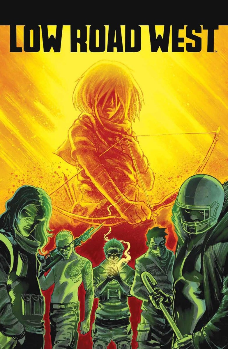
Writer: Phillip K. Johnson
Artist: Flaviano
Colorist: Miquel Muerto
Cover Artist: Flaviano
Publisher: Boom!
Luke: It wasn’t that long ago that we were talking about the first couple issues of Low Road West. You can find my thoughts on those issues here. I loved them, so did issue #3 live up to the strong start? Also, spoilers. Because it’s issue #3. Just so we are clear.
Low Road West #3 begins as the kids continue their encounter with the mysterious government man, and a couple of their number enter a whole new alien world. And there is a journal that talks to people from the pasts, so there’s that too. Can it get any weirder? Did I tell you about the mutant alien attack dogs?
Let’s just get to the point. I love Low Road West. It’s such a bizarre book, mixing teen drama with trans-spatial/trans-temporal science fiction set in a post-apocalyptic American southwest. And it works so well it is hard to believe it without reading it.
The writing on this story is solid. The plot hums along, and yet never strays away from any given character for too long. There’s diversity, there are teenagers who act like teenagers, and the story is flat out fun. I can feel myself getting excited whenever I’m getting ready to pick up the next issue.
The art is unbelievably dynamic. The aliens look surreally alien without being incomprehensible, and the environments pop with excitement and adventure. And the colors are brilliant.
I’m not sure how often I can say this without sounding like a salesman, but read Low Road West. Pick up the single issue. Pick up the trade. Whichever method works best for you, make sure you don’t miss out on what might be the most enjoyable comic series I’ve read all year.
Daughters of the Dragon #1

Writer: Jed Mackay
Artist: Travel Foreman
Colorist: Jordan Gibson
Cover Artist: Travel Foreman
Publisher: Marvel
Luke: I hadn’t heard of Daughters of the Dragon at all when the first issue released. I’m admittedly not quite as connected to the comic book community as I used to be, but this one slid right under my radar. Fortunately, it was briefly on sale for the convenient price of free on Comixology, so I thought, why not, let’s give this thing a try. And it rocked!
Daughters of the Dragon #1 was the buddy action comic I didn’t know I needed. Misty Knight and Coleen Wing are best friends and also professional badasses. Coleen is in California, pursuing leads on a case that involves missing hitchhikers, while Misty is back on the east coast working for the FBI. Coleen is of the act-then-think approach and ends up finding herself in a cult commune run by a man who appears to be host to a demon spirit. Which is when Misty swings by and things get really out of hand.
Jed Mackay does a wonderful job of writing to dynamic characters who are in over their heads. The story feels like a modern pulp adventure, with elements of mysticism, mystery, comedy, and a lot of action. Travel Foreman does solid work on the art too. It feels appropriately fluid and bold to match the tone of the story. If you are interested in a fun, action-packed story, Daughters of the Dragon #1 is a strong issue to fill that need.