
Today, we’re talking about the many, many covers of A Wrinkle In Time.
But first, let me backtrack.
I had this grand plan to countdown to the theatrical release of Disney’s new adaptation of A Wrinkle in Time by posting an article a week expounding on one point or another out of my favorite book. Last week I covered the science of the book, and I promised that this week I would have a great post on the genre. Naturally, massive technical difficulties then ensued in la Casa de Wrinkle-in-Time-Fanatic, throwing my plans into a tesseract.
So I’ll get back to that post on genre next week when I can pull all its molecules back together. In the meantime, let’s look at some pretty pictures.
Or not. Because that beat up hardcover of A Wrinkle in Time I pulled off the school library shelf in fourth grade was the ugliest book I’d ever seen, and the paperback I ordered from the Scholastic Book Club a year later wasn’t much better. It became my go-to example of the importance of Not Judging a Book By Its Cover.
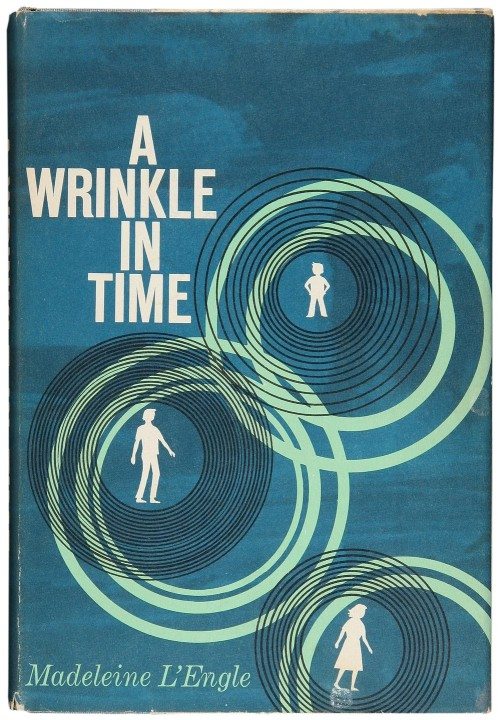
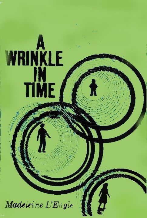
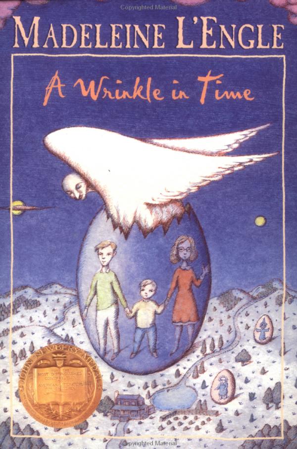
I feel a little bad about that because that hardcover design was the supposedly beloved original, created by eventually-Newbery-Award-winning-author-in-her-own-right Ellen Raskin. In my defense, my school library’s copy did not look nearly that good. It had no dust cover, the black lettering was flaking, the binding color had faded to a puke green. It looked more like this:
But I was a voracious reader, and I knew I’d never get my fill if I stuck only to the shiny new books in the library. I probably still wouldn’t have given this a second glance, because the title made me think of one of those slow, thoughtful books about an old lady telling some ungrateful kids about her hard youth. But we’d watched a filmstrip on Newbery Medalists a few weeks before, and this title had been suggested as something scary and somewhat mindblowing. “Are you sure you’re ready for this?” the filmstrip had said.
I‘m ready for whatever you can throw at me, filmstrip. But that cover there certainly didn’t give me any clue of the depths and heights the insides were about to take me to.
Nowadays, as a public children’s librarian, I have a lot less patience for bad book covers. Sure, there are kids like me, who are willing to take a chance on a horrible-looking book, but the majority of kids wouldn’t think of it. When I see a book in that condition, I’ll only keep it on the library’s shelves if a) it still gets checked out, or at least still has something to say to today’s kids and b) I can’t buy a newer edition in hardcover or library binding.*
A Wrinkle in Time has gone through many editions over the decades, some more clearly dated than others. Let’s see what each one tells us about the adventure inside!
Other Early Wrinkle Hardcovers
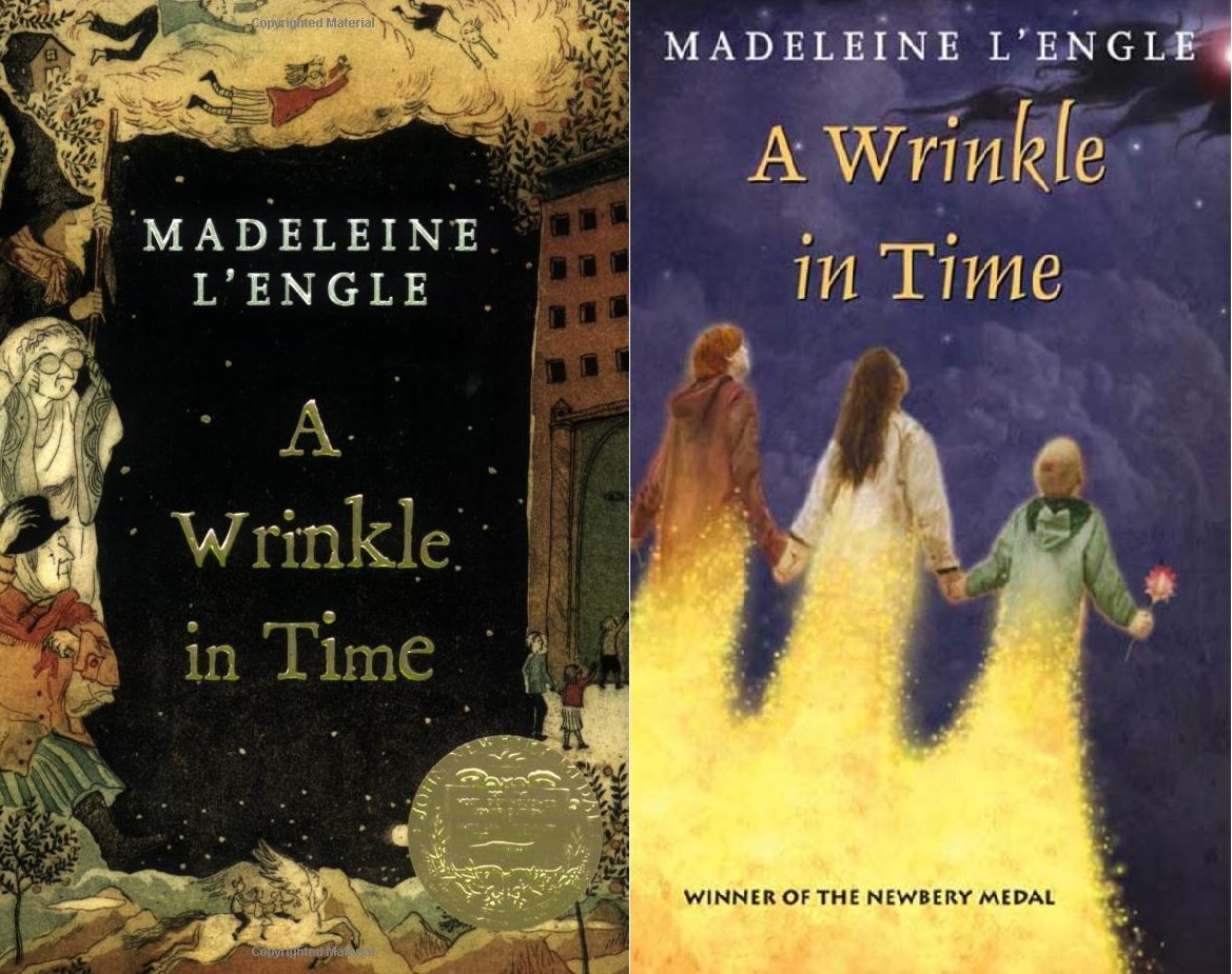
Ellen Raskin’s cover was the go-to for twenty years until multi-Caldecott-winning husband-and-wife team Leo and Diane Dillon drew this cover for the 1983 edition:
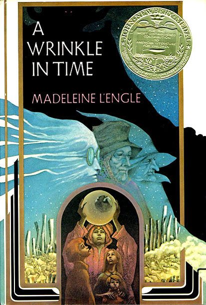
If my school librarian had only replaced that beat-up original when this one came out! The Dillon cover actually gives some idea of what might be inside: eerie landscapes, a fortune teller, three witchy ladies, and an ominous shadow. Granted, the three witchy ladies may not have eased my fear that this was about old people reminiscing, but there is enough else there to peak my interest. It leans more on the fantasy aspects than the science fiction ones—no way to figure out that a wrinkle in time is quantum physics related. And why doesn’t Meg have glasses? Personally, I don’t find this cover particularly appealing, either: it’s dark and the color choices are odd. But it wouldn’t turn me off from the book, and it would certainly do a better job of catching my attention than the original.
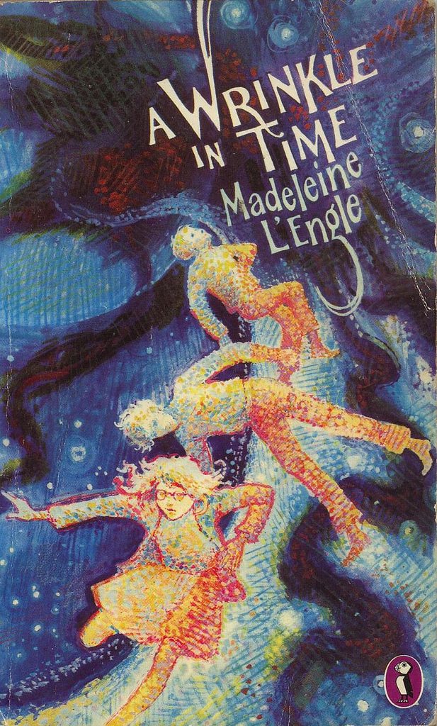
Meanwhile, this next edition pretty much petered out right away when they tried to release it in the UK after it kept winning awards in the US, which is odd because I would have been all over it:
It’s magical and quirky-spooky, and the font reminds me vaguely of 1960s Disney movies. Meg still isn’t wearing glasses, but I wouldn’t have known that was a problem before I read it, so I would have seen nothing to complain about. I would have lunged for it even if I hadn’t heard the title before. For today’s kids, though, it should probably be updated if I wanted it to fly off the library shelves. I was the kid who wasn’t afraid to pick up an old-looking book, but I was weird. It’s awesome-looking but still old.
Now, there are also fancy-bound collectible editions that aren’t quite practical enough for a public or school library, but for a home library? Best yet:
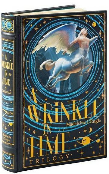
This Barnes & Noble Collectible first-three-Time-books-in-one made me go, “Ooooo!” It looks good, and it somehow manages to balance the fantasy and science fiction elements. Too big for the library, but I don’t think the cover art would turn off most young readers if it was on something smaller.
Paperbacks Through the Decades
This was the cover staring at me when my book order came in during fifth grade:

Gah. I already knew I loved the book, but I didn’t even want to look at this cover. I read it with the cover curled up in my hand, and I put it away so I could only see the back cover. I survived. I still have this paperback, even, now thoroughly annotated as you can see. But I would have dearly desired a different cover if there had been one to buy. But this was before Amazon, and I lived nowhere near a real bookstore. This was all the school book orders offered in 1989.
Dell handled the paperback editions of A Wrinkle in Time for many years, putting it out through two different imprints: Laurel Leaf Fantasy, which published mass market paperbacks directed at people buying their own copies with their pocket change (or through their Scholastic Book Club orders), the covers appealing more to older readers, and Yearling, which published heavier-duty trade paperbacks for classroom use, directed at younger ones (or appealing to the adults who would make it available for them). Here’s the Yearling edition from the same time period:
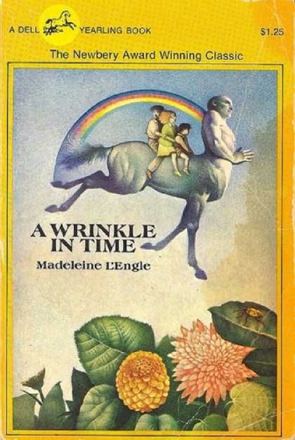
Much less scary. Of course, a little too less scary. Rainbows and a flying horse-creature! It must be a gentle and happy adventure through a magical land! I’m sure that would call out to a lot of potential readers who spot it on the shelf, but it’s giving them a false promise. Plus, nowadays? Yeah. Dated. It was even dated in 1989, had the book order offered it then.
If I had waited a couple more years to buy my own copy, I could have gotten this one instead:
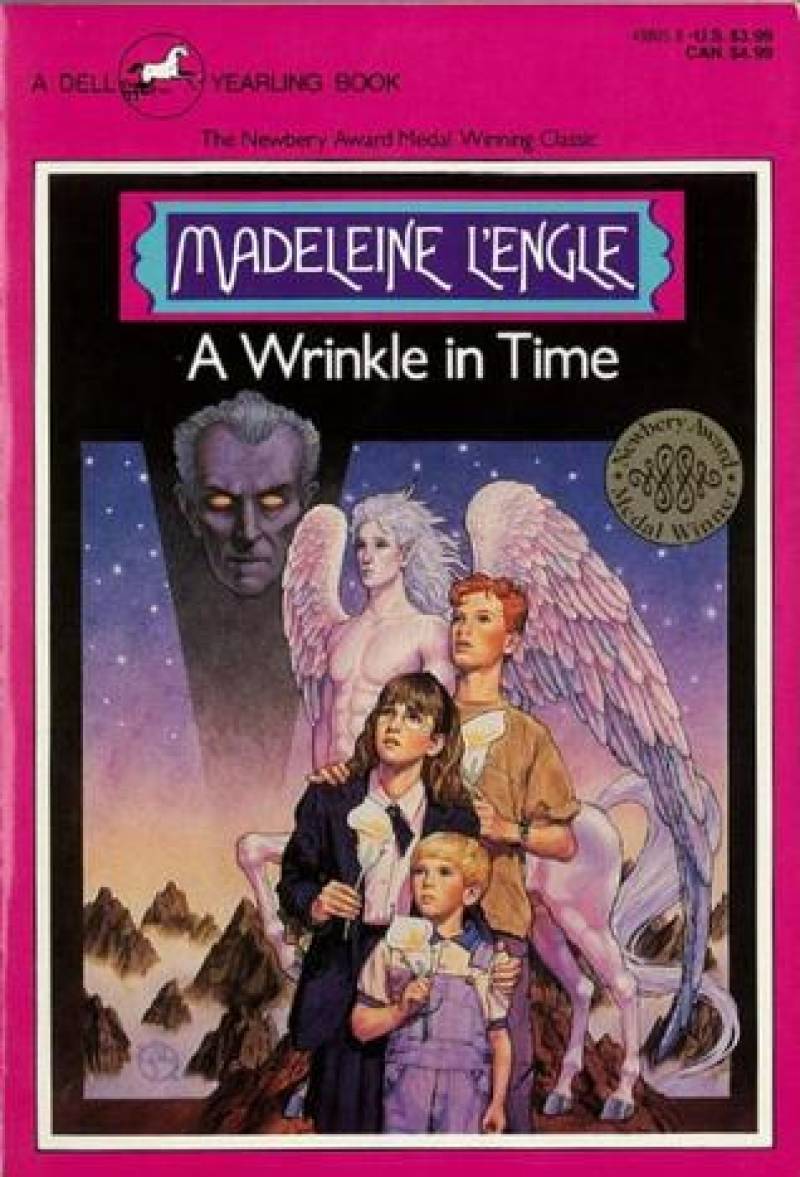
This one absolutely appeals to upper-elementary-school me. It outright illustrates the story, and it’s showing me something I’ll like—fantasy and mystery and kids that look active in their plot. Meg is even wearing her glasses for once. But whether it’s still a good cover, I’m not sure I can objectively say. I grew up with this hyper-realistic book cover illustration style, so it gives me happy vibes. But it undeniably screams out “1991.” Ask anybody in their late-30s/early-40s. We recognize that style anywhere.
Laurel Leaf stuck with the realism for their next edition a few years later:
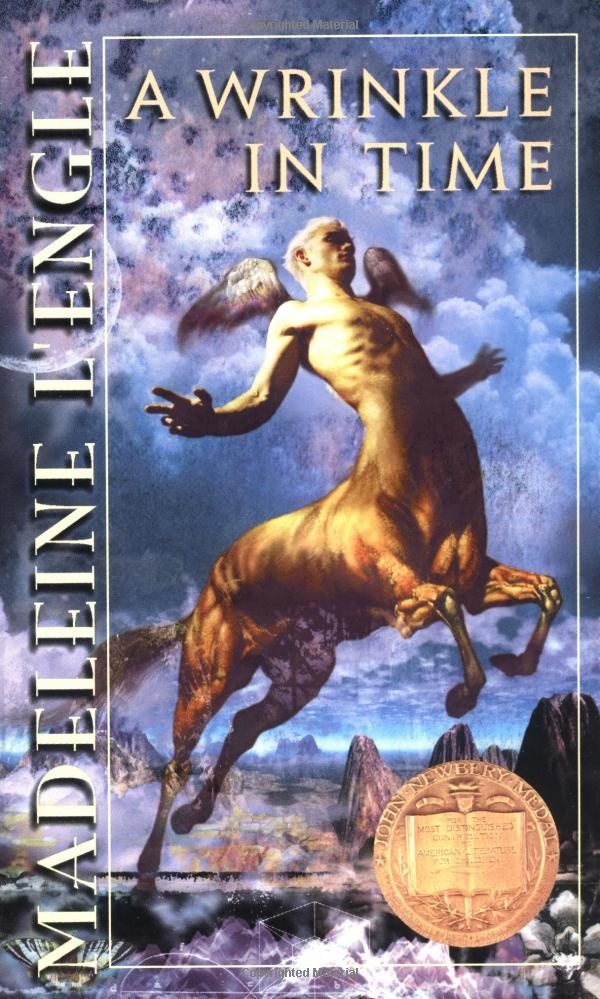
If I didn’t know better, I’d say this one was high fantasy, and the time wrinkling was to the ancient past. Nice, but not very indicative of the content. It’s funny how many of these covers go with the Mrs.-Whatsit-as-flying-centaur theme, when it’s such a small and not particularly plot-vital part of the book. She even looks slightly aquatic in the movie trailers, which will render all these marble-statue-like covers obsolete.
In college I spotted this one in the store:
OH MAN. That was the first Wrinkle cover I’d ever seen that I loved. I’m not sure what the egg imagery has to do with the story, but it’s so pretty I don’t care. I didn’t realize until writing this that this edition was drawn by Peter Sis, award-winning illustrator of grand books like The Wall: Growing Up Behind the Iron Curtain and Tibet: Through the Red Box, but also Fire Truck. Peter Sis’s Fire Truck is always a hit with three-year-olds. I’m not surprised this cover came from someone who’s made a name for themselves in illustration.
Anyway, in 2007, paperback rights for this reverted to Square Fish, an imprint under the same company as Wrinkle’s hardback home, Farrar Straus & Giroux. They immediately released two new editions:
It’s funny, with a term like “mass market,” you’d think the version on the right would be more common, but I’ve never seen it in the wild. Maybe because it’s eh. It’s nice, but I just have questions. Why does a tesseract look like a rocket launch? Why does Charles Wallace have a scepter? Why does Calvin look so much like a Chamber of Secrets-era Rupert Grint? Why can I tell that much about him, but I can’t tell if Meg is wearing glasses? I like the shadow creeping into the upper right, but on the whole, eh.
On the other hand, the trade cover—which I do see frequently in both bookstores and libraries—has the opposite effect on me. At first glance I barely see it: it’s brown, it’s got indistinct little illuminations around the sides. But the more I look at it, the more I see—and appreciate—the details. Look at the expressions on the Mrs. Ws’ faces! Look at how each corner is a new scene! It’s not a design that jumps out from the shelves, but it rewards closer study.
Around the World
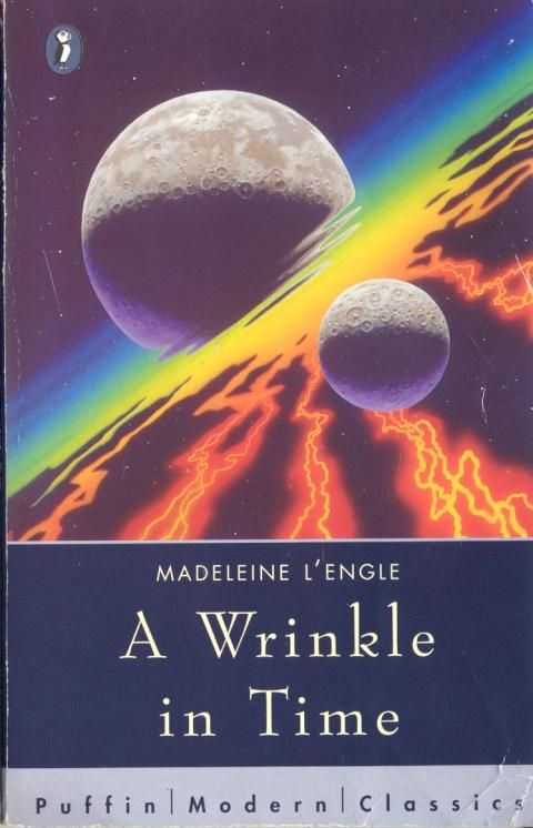
A Wrinkle in Time never took off in other countries to the extent it did in the United States, but the publishers did try. Less than a decade after the UK hardcover failed to take off, Puffin released this paperback version for the UK and Commonwealth:
I can’t find any information on the illustrator, but the style is similar to the UK hardback, and I love it. Why didn’t UK audiences take to it? Puffin tried again a couple decades later, with this cover that seems to appeal to adult science fiction readers, instead:
Kind of generic. Probably false advertising for those hardcore SF fans who’d be annoyed at the focus on kids and their social problems. But not entirely inaccurate.
Never mind, this is the cover Puffin is using nowadays, and I like it:

And people in the rest of the English-speaking world are finally discovering it, but that’s more likely because of word of mouth from people being friends across the internet (I am pretty sure that I am the librarian-friend Sophie refers to in this old Between-the-Bookends post about when she first discovered it) than a simple cover change.
The only foreign language edition I found in my perusing was this cute Chinese edition that seems to be inspired in part by Peter Sis’s cover, at least in the design of Mrs. Whatsit’s angelic form:

That and maybe The Little Prince. And I wonder why the moon is smiling? All the celestial bodies in this book seem angry if any emotion. But it’s super-cute, at any rate.
The Current State of A Wrinkle in Time Covers
The 50th Anniversary brought A Wrinkle in Time covers full circle, by updating Ellen Raskin’s original design for both hardcover and paperback editions:

I don’t think I realized the silhouettes are standing in different positions until I saw the hardback and paperback editions side by side. Oddly enough, for someone whose favorite color is blue, I like the orange of the hardback better (and yes, I made sure my public library had this edition). What you can’t see from the picture is that the paperback (my copy of which I actually won from a giveaway here on GeekMom) is actually a shiny foil print. It may have the same design as that ugly first edition I read, but this one nonetheless is pretty.
That same year, the publisher put out the graphic novel by Hope Larson, which we can’t not include:
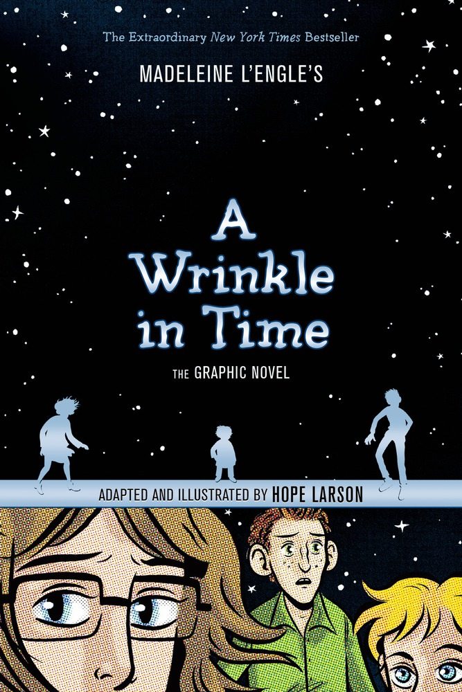
As I’ve mentioned before, my brain doesn’t work well with the graphic format. But because I know this book so well, for once I didn’t have to strain my brain trying to sort out new input when I read this one. It’s kind of like watching a movie adaptation of it, I thought to myself at the time.
And now there is a new movie adaptation. And a movie adaptation needs a movie tie-in cover.

I’m not sure about Disney sticking its name at the top left of the title, making it look like a novelization of their creation instead of a great novel in its own right. But otherwise, I like all of these, especially the first one, even if the palm trees seem wrong for a book actually set in Connecticut (what. I’m fine with the race bending and gender bending and centaur-like-angel-creatures-looking-aquatic-bending, but whyyyyyy does Hollywood feel the need to reset everything in California? They don’t even have seasons!). The sense of warping, the colors, Meg smack in the beam of light shining from the supposed time wrinkle in the logo? It’s gorgeous. I’m not sure why Barnes and Noble needed an exclusive cover that takes out most of those details. I’m surprised only the international edition actually looks like the movie poster, with the actors-in-character right up front—surprised, but not disappointed. That might sell more books (“Oh look! It’s Oprah!”), but it relegates Meg to one of many. Sure, you can’t clearly see her on the US edition, yet it makes her starring role much more pronounced.
My verdict? The 50th Anniversary hardback is the one I would purchase for the public library, with the Leo and Diane Dillon cover in second. But I think my personal favorite is the original UK cover. With all of these covers to choose from, which would catch your eye, and which best hints at what’s inside?
*And then I’ll put it on display and post a challenge, like, “Read this great book and then design a new cover for it that isn’t so abysmal!”


What do you make of the first Puffin paperback edition (image from ISFDB)
http://www.isfdb.org/wiki/images/f/f7/WRNKLNTMRB1967.jpg
Ahh, I’ve never seen that one! That’s freaky. I would definitely have run far away from that as a child. I’m not sure about other people!
Makes me think of the children in Village of the Damned. Definitely something to run away from.
I have the first Laurel Leaf fantasy edition. That cover looks more like an album cover for Pink Floyd or Journey than a children’s fantasy/ sci-fi adventure.
The 1991 Dell Yearling is a favorite of mine, mainly as it looks like the artist did some speculative fan casting for the Man with Red Eyes and chose Peter Cushing from Star Wars for the role.
Haha, absolutely true on both counts! I think I subconsciously recognized Peter Cushing there, too, but never put it into words.
I (unfortunately) have the Disney version of the cover. I just picked it up and thought I would read it before the movie to have a gist of what I was in for(I never got around to reading the book (not even as of writing this) but I also was not aware of the host of covers it has received over the years. When I was in Books A Million and saw all the choices on the table I thought “well this book really must be something to have so many covers…”
The one that MOST catches my eye is the Leo and Diane Dillon cover. Something about it just draws me in and I get the most feel for what genre it’s supposed to be: a science fantasy story. It has a balance of scientific themes and mystical themes. But then I saw the Trade cover (which I thought was the original cover since this was the version that I saw in my college library.) Complete with the whole quintet, which I was planning to save up to get. However, I’m torn between getting this set, buying the Leo and Diane Dillon cover and buy the remaining four separately, or just do both and have three different versions of the first book.
…I think I may just do that.
Thank you, Amy, for this excellent article. Strangely enough, I much prefer the “Original Cover by Raskin, 1962, Farrar Straus & Giroux,” and I probably love it because it was the first cover I ever saw on the book. I still think that showing Calvin, Charles Wallace, and Meg in those vibrant circles is much more representative of the book than anything else. I am especially flummoxed by the centaur or flying centaur or winged horse that appears so often on the covers. To me, the first time I read the novel, that element was fleeting and a little too fablish for a story that seemed to rely on its sort-of science to get the children from one place to another. I, too, love blue, and the contrast with the green (the cover I saw was not as worn as the one you saw), and I may have been attracted to the cover first because of that. I agree completely with you that covers on ALL books are lamentable bad, and in your retrospective, I can see that the cover of A Wrinkle in Time has suffered excessively. This story not only confirmed me as a reader, but also set me on the path to being a writer, and I will always love the book and thank Madeleine L’Engle for the gift to me and to so many others that her wonderful novel is.